


Power Provider Tiering | Care.com | New feature | Release 3/ 24, 2016 | Three platforms | Lead mobile design
POWER PROVIDER TIERING
Background:
Care.com is the world largest online platform connecting families and care providers. It has 9.7 million members across 16 countries.
Problem:
Low conversion rate, low provider profile quality and low product trusty become the bottleneck to our transactional model.
Product goal & metrics:
Increase responsive rate, profile completeness, market engagement, ratings. Incentivize providers with a power status.
Responsibility:
Delivery the end to end mobile solution & experience.
Design Challenge:
Revisit product information priority involves cross-team decisions. Create new design guidelines & product logic. Align issues working remotely.
Impact:
Increased 30%+ marketplace interactions.
FRAMEWORK
Kickoff
Cross team sync up meetings, understand the road map, visions, goals and resource limits.
Identify & validate Problems
Facts from data scientists
Provider interaction in marketplace was low. | Service provider (sitters) profile completeness was low. |Few job applying per sitter | Review rate was low |New user first interaction time was long (slow on-boarding) | Response time long (94% >24 hours).
UX investigation
Design & conduct the on-site user interview to help PM determine features and understand user needs & expectations.

Recruiting email

Cards Sorting & Ranking

Consent Form
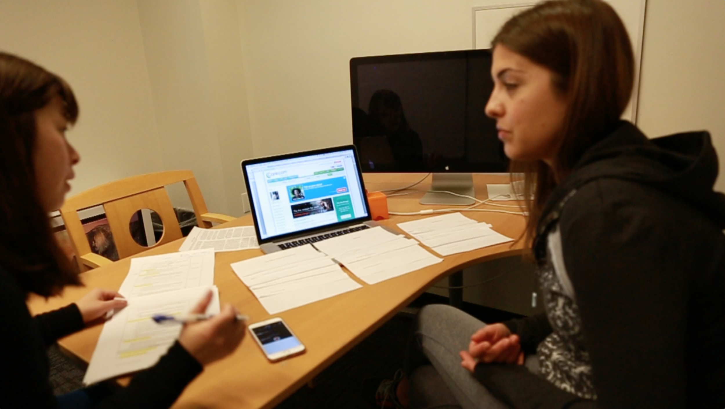
On Site User Interview | Participant: Child Sitter| | Redwood City Office

Facility Sign
Validate UX flaws
Less engaging motivation for providers.
Lack of notification & guides leading to long message response time from provider.
Willing to but don't know how to improve the profile and reviews.
Too many description instructions.
UX Solutions & mockups

Concept Sketches

Flows
User A - PAIN POINT
"I'm willing to but don't know how to improve the profile and reviews."

Homepage- before

Homepage- After
Solution example 1
Simplify & increase the product discoverability - by building a home page user dashboard. Existing key user tasks are spread out in different pages and are buried too deep for user to track their progress.
Solution example 2
To-do list to decrease the user cognitive workload & expedite the user information processing speed. Followed memory chunks limits and Millers' magic number 2 ± 7 principle.
Solution example 3
Design empathetic experience - only displaying relevant information by user's different status.
User B - PAIN POINT
"I am a busy college student. I don't see any point updating my profile. I'm not sure if it's worth spending time on."


Solution example1
Gamification. Designed provider 3 levels tiering & incentive badges to motivate and guide provider move up. Displaying the visual treatment to both provider and seeker sides.


Solution example 2
Animation, badges & visual treatments. Subtle animation support user attention focus, help users confirming their current status, also increase the user engagement.
User C - PAIN POINT
"I didn't know my response time was long. Where do I track it?"

Solution example
Data Visualization. Take advantage of user's concept stereotype from other digital experience. Simplify the complex rules with dial meters, progress bar, star ratings, badges & small visual treatments.


Delivery & Collaborate
Omnigraffle & InVision for demo & feedback. Sketch 3 for exporting to engineers.

